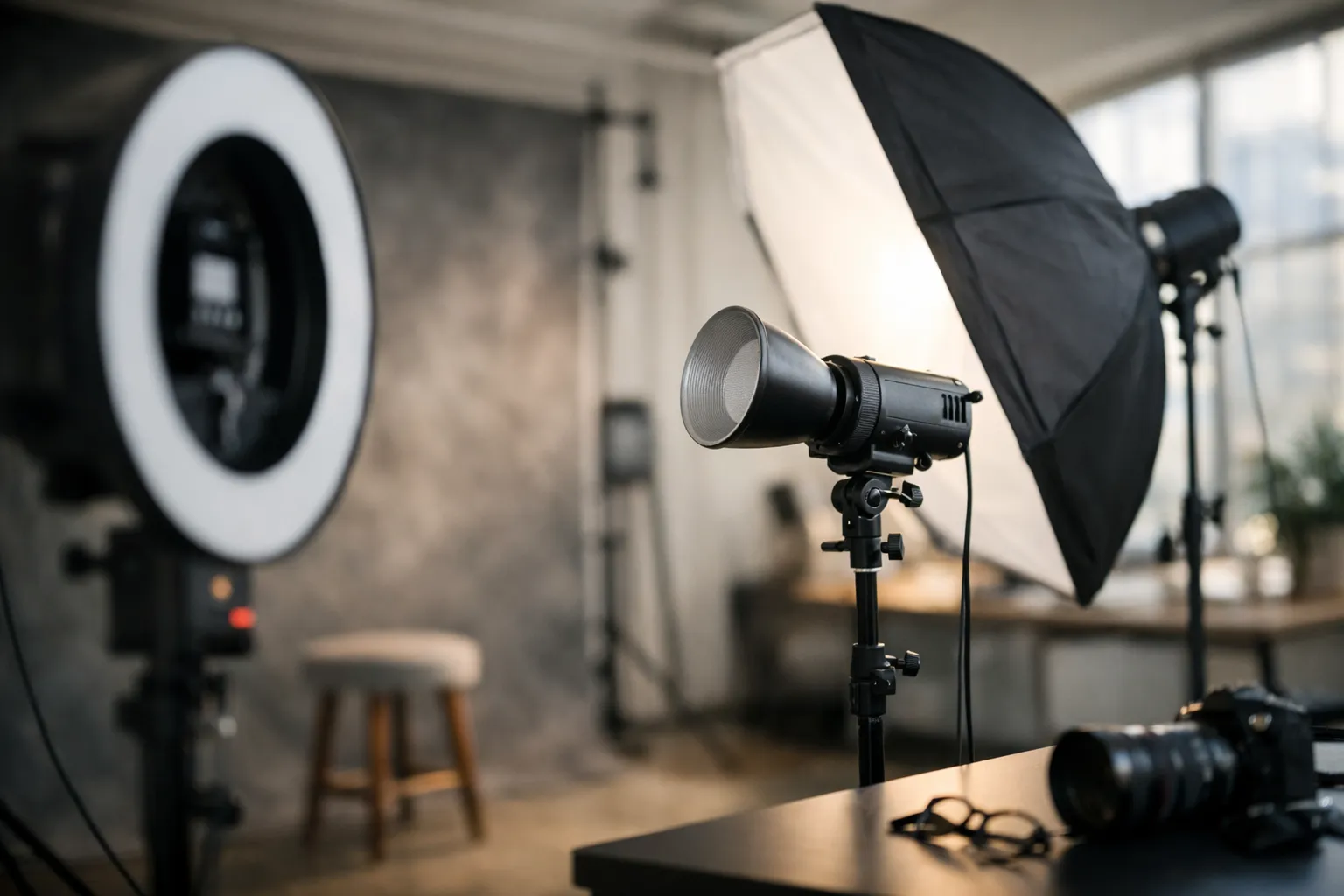
Do you ever see someone’s LinkedIn photo and, before you read a single line of their bio, you already feel something-competent, friendly, intense, old-school, modern? That’s not your imagination. A headshot is a tiny piece of communication design.
In one small square, you’re telling people how you show up in meetings, how you lead, and whether you’ll be easy to work with. And because we live on screens now, the “small stuff” (background tone, eye line, crop, even the shine on a forehead) suddenly carries a lot of weight.
This guide breaks down what actually works in corporate headshots examples-without turning it into a fashion show or a camera manual. We’ll look at styles that fit different roles, how teams stay consistent without looking copy-pasted, and how lighting changes the emotional read of an image. If you want more corporate headshot ideas to compare against, it helps to skim a few layouts and looks side by side. We’ll also cover practical specs (LinkedIn crops, press kit sizes), plus where AI headshots help and where they can quietly backfire.
If you’re planning a shoot for yourself, your leadership team, or a whole company, treat the sections below like a practical checklist. The goal isn’t perfection. It’s something much more useful: headshots that look like real people you’d trust, in the kind of workplace you’d actually want to join.
Modern corporate headshots examples and styles (2026-ready)
A modern headshot isn’t about chasing a trendy pose. It’s about speaking today’s visual language: clean, intentional, and made for screens.
Think of it like UI design for your personal brand. If the image feels cluttered, over-edited, or oddly dramatic, viewers sense friction. If it feels calm and clear, they relax-and keep reading.
Style pillars: editorial, approachable, and authority-driven looks
If you’re stuck choosing a direction, don’t start with “What looks cool?” Start with: what do you need this photo to do for you?
Editorial looks borrow from magazine portraiture. You’ll see a little more contrast, deliberate negative space, and backgrounds that feel “chosen,” not accidental. This is great for founders, keynote speakers, consultants, and anyone whose job includes visibility beyond the org chart.
Approachable looks are the safest choice for most roles-and “safe” isn’t an insult. The expression is open, the light is soft, the styling is simple. If your work depends on trust at scale (sales, customer success, healthcare administration, HR), this look is a reliable default.
Authority driven looks use cleaner lines and slightly more structured posing. The expression is calmer, shoulders are more squared, wardrobe leans classic. You’ll spot this often in executive headshot examples for board members, attorneys, finance leaders, and senior operations.
One line to remember: the goal isn’t to look impressive-it’s to look dependable.
Backdrops and color palettes that photograph well on screens
Backgrounds behave differently on screens than they do in real life. A textured office wall that feels subtle in person can turn into “visual static” once it’s compressed and shrunk to a thumbnail. Ever noticed how some photos look fine on a website but messy on LinkedIn? That’s usually the background (and compression) doing damage.
If you want a backdrop that survives every platform, stick with:
Neutral gradients (light gray, warm off-white, slate) that keep attention on the face.
Soft environmental blur that hints at a workplace without showing distracting details.
Brand-aligned solids that echo your site accents but don’t fight skin tones.
When you’re choosing colors, aim for contrast and harmony, not perfect matching. A navy blazer against a mid-tone gray reads crisp. Beige on beige can flatten your face and make the image feel washed out.
If you want a quick gut-check on a palette, the Adobe Color tools are handy for exploring complementary and analogous schemes.
Micro-story: a product team at a startup swapped a bright white background for a warm light gray and kept wardrobe in deep blues and muted greens. Their site looked more cohesive overnight-without touching the logo. That’s why background choice is often a brand decision disguised as a photo decision.
Professional corporate headshot examples for LinkedIn profiles
LinkedIn is where headshots do the most work with the least context. People skim fast. Your photo has to read clearly at thumbnail size-and still feel like a real person when someone taps to enlarge.
So what matters most? Clarity, warmth, and a crop that doesn’t fight the platform.
LinkedIn crops, safe zones, and banner pairing
Before you shoot, decide the final crop. Most people look strongest in a head-and-shoulders frame with a bit of space above the head. Too tight and it can feel intense. Too wide and your face gets lost.
A practical rule: keep your eyes in the upper third of the frame, don’t cram your chin into the bottom edge, and shoot slightly wider than you think you need (you can always crop later).
For current guidance on profile photo basics, LinkedIn’s own help pages are worth a quick check-especially if you manage multiple accounts. Start here: LinkedIn profile photo guidelines.
Banner pairing is an underrated move. If your banner is visually busy, keep the headshot background calm. If your banner is clean and minimal, you can get away with a slightly more environmental background in your portrait. The two images should feel like they belong in the same design system.
Here is a quick quality checklist you can use when reviewing business headshot examples for LinkedIn:
- Face is evenly lit with catchlights in both eyes
- Background is simple and not competing with hair or shoulders
- Expression matches role, friendly for client facing roles, composed for leadership
- Crop leaves room above head and does not cut into shoulders awkwardly
- Wardrobe avoids tiny patterns that can create a moiré effect on screens
Aligning headshots to your role and personal brand
A headshot isn’t a costume-but it is a signal. If your work is collaborative, a slight lean forward and a softer smile reads like “easy to talk to.” If your role is high-stakes decision-making, a more neutral expression and stronger posture can read as steady.
Ask yourself one question before you pick wardrobe: what do you want a stranger to assume about you in two seconds?
Try a simple exercise: write three words you want your photo to communicate. Common choices are “clear,” “modern,” “trustworthy,” “strategic,” “creative.” Then match your wardrobe and background to those words. Creative doesn’t require loud colors; sometimes “creative” is texture, depth, and a confident, relaxed expression.
Real-world outcome: a 38-person fintech refreshed team headshots and aligned the look to roles. Client-facing teams used brighter backgrounds and warmer expressions; leadership used darker neutrals and more structured posing. Over the next month, recruiters reported a 27 percent average increase in profile views using LinkedIn analytics screenshots. Outreach response rates improved enough that they shortened their follow-up sequence by one step. The photos didn’t “close deals,” but they removed friction-people clicked, paused, and stayed a little longer.
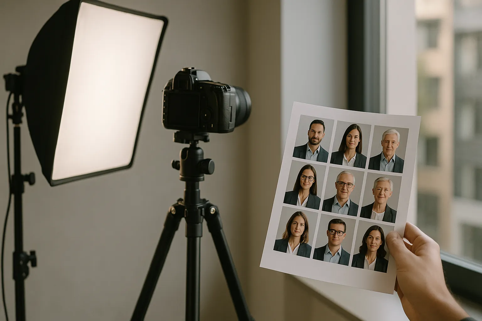
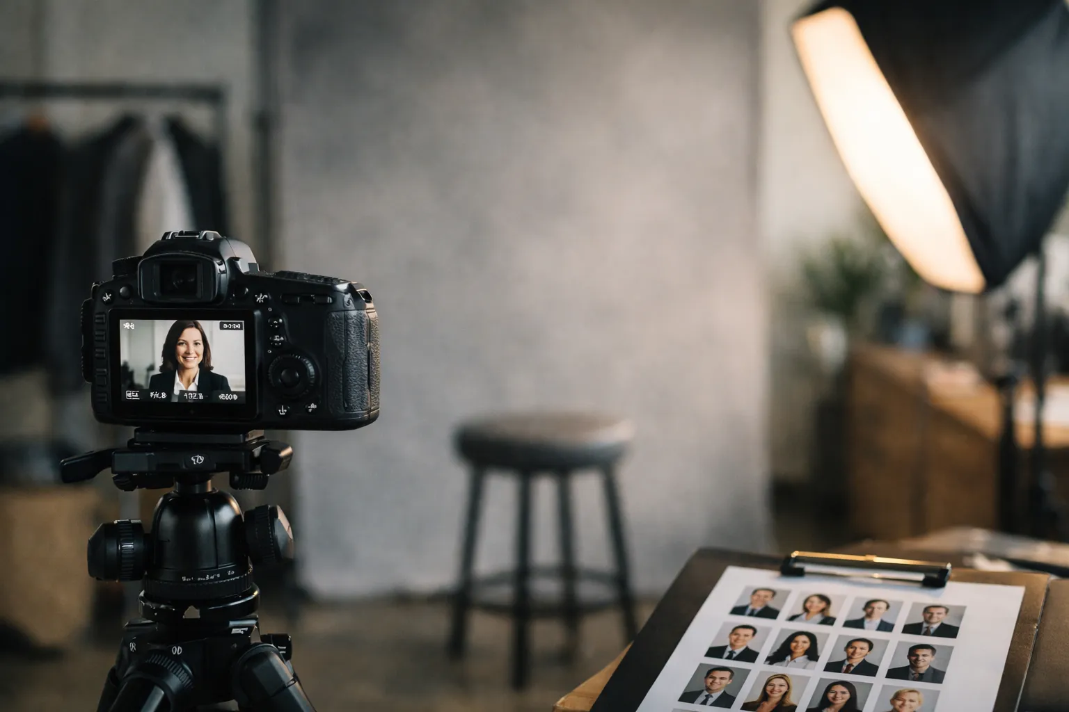
Team and executive corporate headshots examples with poses
Teams add a layer of complexity: you need consistency, but you also need each person to look like themselves. The strongest company headshot samples feel like a choir, not a lineup of identical robots-same key, different voices.
Team layouts, consistency, and on-brand variations
Consistency starts with a shared recipe: similar focal length, the same lighting direction, and a limited set of backgrounds. Within that recipe, you can vary small elements-stance, angle, expression-so people don’t look cloned.
If you’re photographing a team across locations, document everything. Save lighting diagrams, camera height, the subject-to-backdrop distance, and a short posing script (“turn shoulders, chin forward, soft smile”). That documentation is what turns a one-off photo day into a repeatable system, and these corporate headshots guidelines help keep the standards clear when multiple photographers are involved.
For global teams, consistency is usually easier if you standardize two approved looks: one more studio-style for formal uses (press, leadership pages) and one softer workplace headshot style for internal tools and more casual pages.
Executive poses, expression coaching, and wardrobe
Executive portraits work when the subject looks relaxed and decisive at the same time. Sounds contradictory, right? It’s mostly micro-adjustments.
A coaching cue that works surprisingly well: turn the shoulders slightly away from camera, then bring the forehead subtly forward. It feels tiny, but it sharpens the jawline and adds engagement. For tight crops, keep hands out of frame unless you’re intentionally going wider for an editorial look.
Wardrobe matters more than most people think, not because it has to be fancy, but because cameras punish poor fit. A collar that pops up, a jacket that pulls at the button, or a wrinkled blouse can steal attention from the face. Solid colors photograph cleaner than tight stripes. If you love patterns, go larger and simpler.
One expression cue that often lands well: think “pleasantly serious.” It sits between a sales smile and a stern look.
“The strongest executive portraits look like a conversation you want to continue. Not a performance.”
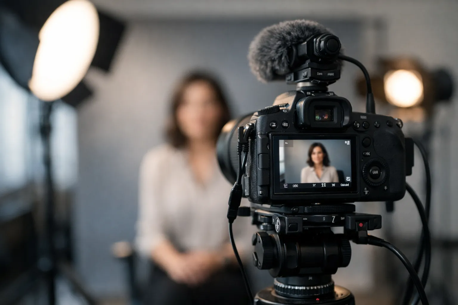
Natural light vs studio corporate headshots examples
Lighting isn’t just technical-it’s emotional. Natural light often feels open and human. Studio light can feel polished and controlled. Neither is automatically better.
So which one fits your brand? And just as important: which one can you repeat without chaos?
Decision factors: brand, space, timeline, and budget
Natural light is beautiful when you have a large window, consistent weather, and time to work. It can be fast for a one-person shoot, and it often reads as lifestyle-oriented-great for creative industries, boutique firms, or founders who want something less “corporate.”
But natural light can also be unpredictable. One cloud moves in, and suddenly half your team looks like they were photographed on a different day.
Studio light shines when you need repeatability. If you’re photographing 30 people in one day, you can’t afford exposure changes every five minutes. Studio also saves you from mixed office lighting (overhead fluorescents plus window light), which can create odd skin tones that are time-consuming to fix.
Budget isn’t just photographer cost. It’s productivity. A reliable studio setup can move people through in five to eight minutes each with fewer reshoots-and that’s real money saved in lost work time.
Hybrid setups that mimic daylight with full control
Hybrid lighting is the sweet spot for many modern headshot galleries. You use a softbox or large LED as your key light to mimic window softness, then add subtle fill so shadows stay gentle. The result looks natural-but stays consistent across the day.
Here is a simple comparison to help you decide which approach matches your situation.
| Factor | Natural light | Studio light | Hybrid approach |
|---|---|---|---|
| Look and feel | Airy, candid, often softer | Polished, high control | Natural feel with repeatability |
| Consistency | Medium, depends on weather and time | High | High |
| Space needs | Needs a good window and clean background | Can work almost anywhere | Needs some space, flexible |
| Speed for teams | Slower if light changes | Fast | Fast |
| Common risk | Uneven color casts from nearby walls | Overly dramatic if set too hard | Slight setup complexity |
One liner: choose the light that matches how you want your company to feel.
Formats, sizes, and AI corporate headshots workflow (with before-and-after examples)
Once you have images you actually like, the next bottleneck is production. Crops, filenames, and export sizes sound boring-until someone uploads the wrong version to the careers page and suddenly half the team is blurry.
If you’re collecting corporate headshots examples to model your rollout, pay attention to the unglamorous part: consistency in output. That’s what makes a set feel “brand-level,” not accidental.
Output specs for web, LinkedIn, press, and print
Decide on a master file, then create purposeful exports. Your master should be high resolution, color-corrected, and minimally retouched (clean skin, yes; plastic skin, no). From there, make separate versions for each use so you’re not repeatedly compressing the same file.
A practical export guide:
- Master archive: 4000 px on the long edge, JPEG at high quality, plus a layered edit file if needed
- Web team page: 1200 to 1600 px square, optimized for fast loading
- LinkedIn: 800 px square, with safe margins so faces do not feel cramped
- Press kit: 2400 px on the long edge, neutral background if possible
- Print: 300 DPI at the intended print size, avoid upscaling from web exports
And here is a quick specs table you can hand to whoever manages your site and brand assets.
| Use case | Recommended crop | Suggested size | Notes |
|---|---|---|---|
| LinkedIn profile | Square | 800 x 800 | Leave extra headroom for circular crops in some views |
| Website bio page | Square or 4:5 | 1200 x 1200 or 1200 x 1500 | Keep backgrounds consistent across a team |
| Speaker or press page | 4:5 or landscape | 2400 px long edge | Provide both color and black and white if requested |
| Internal directory | Square | 600 x 600 | Prioritize clarity and friendly expressions |
| Print brochure | Varies | 300 DPI final size | Export from master, not from web copies |
Get these results: schedule a shoot or AI makeover (link to Corporate Headshots)
AI can be genuinely helpful when you need speed, when your team is remote, or when you have a solid source photo and need controlled background or wardrobe variations.
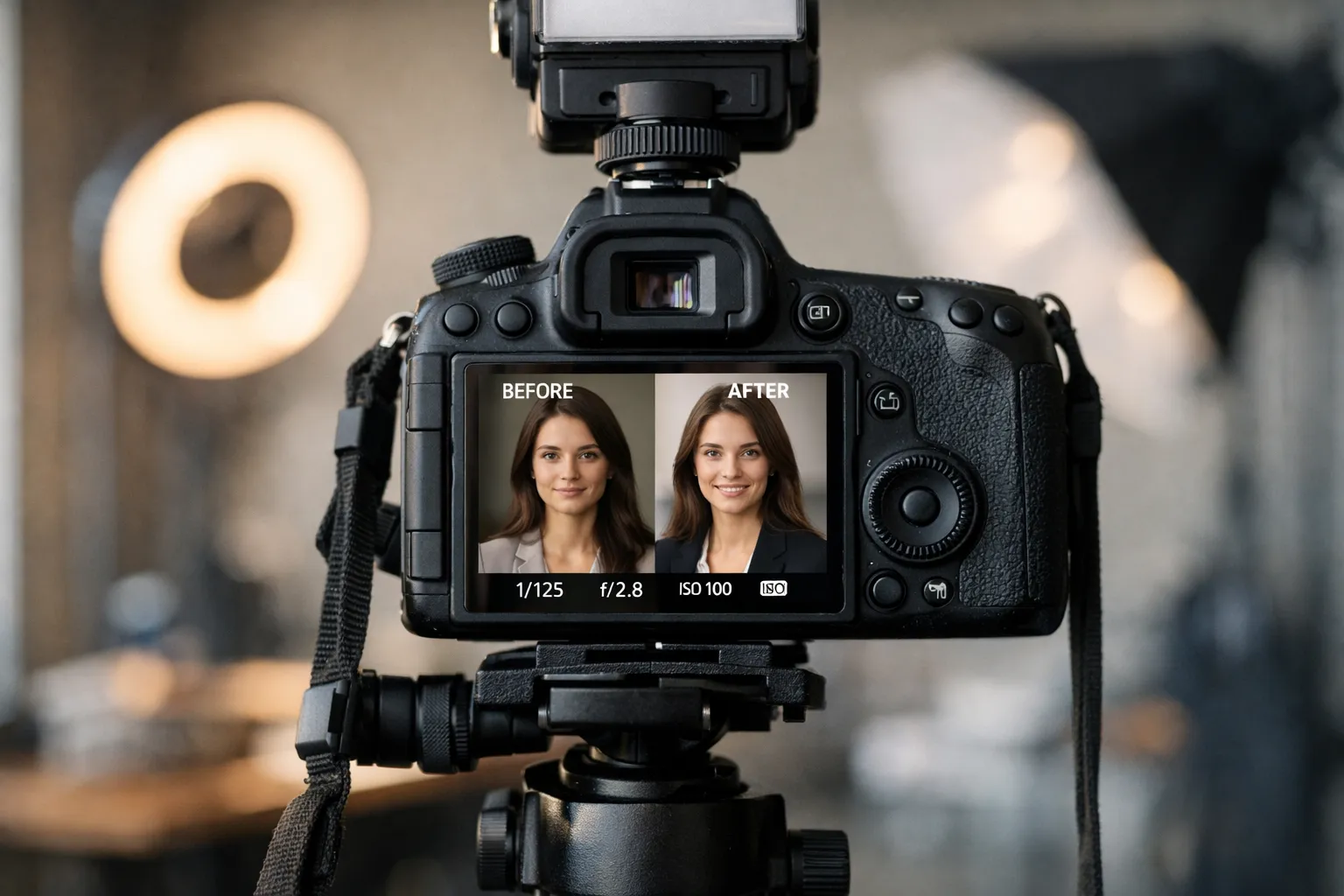
It can also go sideways fast. The biggest risks: it changes facial structure, invents weird accessories, or over-smooths skin until the person looks like a wax figure. And if you’re wondering, “Will people notice?”-yes. Especially at leadership level.
A sensible AI workflow starts with a great base image: sharp eyes, clean lighting, and a natural expression. Use AI for controlled edits like background replacement or subtle cleanup. Then review outputs at thumbnail size and full size. If it feels off in either view, it will feel off to everyone else.
If you want a dedicated AI solution, a solution many teams evaluate is Headyshot's Corporate Headshots for fast, style-consistent variations. Treat the results like a draft, not a final truth.
If you prefer the traditional route, schedule a professional session and build a reusable library. You can also explore our process in more detail here: What are Corporate Headshots for Teams?.
Punchy reminder: speed is useful, but trust is the real deliverable.
FAQ for corporate headshots examples
A few questions come up every single time a team plans new portraits. These answers are meant to keep you moving-because it’s easy to lose a week debating background shades.
What makes a corporate headshot look modern in 2026?
Modern is mostly about restraint and realism. Skin texture should still look like skin. Lighting should feel soft and intentional. Backgrounds should be simple, with enough depth to separate you from the scene.
It’s also about context. A modern headshot should look like it belongs next to a digital product: clean, readable, and consistent with your brand visuals. If you look like you were cut out and pasted onto a random stock background, people sense it immediately. Have you ever seen a headshot that feels “AI-adjacent” even when it’s real? That’s usually why.
How often should I update my corporate headshot?
A good rule is every two to three years, or sooner if your appearance changes meaningfully-major hairstyle change, significant weight change, or a role shift into a new level of visibility.
Also update if your company rebrands. When the website gets a new color system and typography, mismatched portraits can make the whole redesign feel unfinished.
Can AI replace a traditional headshot session?
Sometimes, but not always. AI is useful for quick iterations, remote teams, and filling gaps when you can’t coordinate a shoot. It struggles when you need a very specific look across a large team, or when the source photos are inconsistent.
A traditional session is still the most reliable way to get consistent lighting, true-to-life color, and natural expressions. Many companies land on a hybrid approach: shoot once, then use AI for minor variations, background options, and resizing.
What’s the best outfit color for my skin tone and preferred backdrop?
Start with contrast. You want separation between hair, clothing, and background. Deep jewel tones like navy, forest green, and burgundy flatter many skin tones and photograph cleanly. If your background is dark, choose a lighter top. If your background is light, choose a deeper tone.
If you wear glasses, avoid bright white shirts under strong lights-the reflections can pull attention away from your eyes. For makeup, the camera generally wants a touch more definition than everyday, but nothing shiny.
How do we keep headshot consistency across global teams?
Treat it like a brand system, not a one-off photo day. Create a simple standard: background options, lighting direction, crop rules, and retouching boundaries. Share a one-page guide with local photographers and ask for test shots before the full day.
For remote employees, provide a kit: a small light, a neutral backdrop, and a short setup tutorial. Then centralize editing so color and crop stay consistent. Consistency is rarely an accident.
Conclusion: Put these corporate headshots examples into action
Pick a look that matches your brand, lock the technical recipe, then keep the human part front and center. The most effective portraits feel like you on your best day-not someone else wearing your face.
If you do one thing this week, do this: pull up your current headshot next to your website and LinkedIn banner at thumbnail size. Does it feel like it belongs? If not, don’t panic-you now know which levers to pull: crop, background, light, wardrobe, and expression. And when you’re collecting corporate headshots examples for inspiration, remember the goal isn’t to “look impressive.” It’s to look like someone people want to work with.