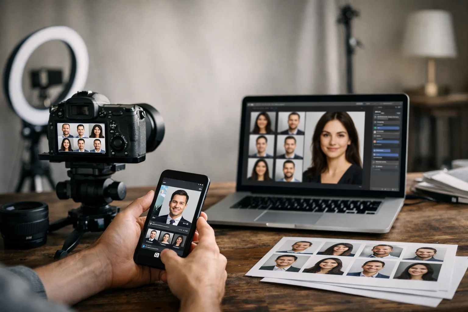
Have you ever noticed how a website can feel instantly polished, or instantly improvised, just from the staff photos? If half the team looks like they stepped out of a magazine shoot and the other half looks like they were cropped from vacation photos, your audience is forced to do extra mental work: Who is on this team, who is customer facing, and how professional are they really? That split second of hesitation matters on About pages, proposal decks, speaker bios, and even in email signatures.
That is why corporate headshots guidelines are not about vanity. They are about clarity. A consistent look helps prospects recognize your people, helps recruiters trust your culture, and helps employees feel represented in the same visual language. It also makes life easier for marketing teams, because they are not constantly fixing mismatched crops, backgrounds, and lighting.
This guide gives you a practical, team friendly standard you can roll out whether you are photographing ten executives in one office or collecting remote portraits across five time zones. We will cover wardrobe, grooming, framing, lighting, file specs, and a simple policy that keeps everything consistent without making employees feel micromanaged.
Corporate Headshots Guidelines: Why Consistency Matters and How to Use This Guide
A strong team photo set works like a well tuned chorus: each voice is distinct, but the overall sound is coherent. When headshots vary wildly, your brand looks fragmented, even if your work is excellent.
Consistency matters because headshots appear in places where trust is built quickly: a LinkedIn profile, a pitch deck slide, a conference program, a press release. People may not consciously analyze the differences, but they feel them. One crisp portrait next to a dim webcam capture creates an unspoken hierarchy, even if both employees have the same seniority.
Here is a micro story that shows the impact. A mid sized SaaS company updated 64 employee photos using a single style: matching crop, neutral background, and similar lighting. They also replaced mismatched images across their website and sales collateral. In the following quarter, their outbound email reply rate rose from 3.1 percent to 3.7 percent, an 19 percent relative lift, which the sales team partially attributed to "looking more established" in signatures and proposal PDFs. It is not magic. It is coherence.
Use this guide in two ways:
First, as a planning checklist before you schedule sessions. Decide the look, set expectations, and remove ambiguity. Second, as a quality control tool after the shoot. If someone submits a photo that is slightly off, you can point to a shared standard instead of giving subjective feedback.
One punchy rule to remember: your headshots should look like they were taken for the same company, on purpose.
For public facing profile photos, many teams also cross check with platform requirements such as the LinkedIn profile photo guidance. It is not a style guide, but it helps you avoid obvious pitfalls like tiny faces and overly cropped frames.
What to Wear for Corporate Headshots: Wardrobe and Grooming Standards
Wardrobe is the fastest way to create unity without forcing everyone into identical outfits. The goal is to keep the focus on the face while staying aligned with your industry and brand personality.
When you write employee portrait guidelines, think of them like stage lighting for a play. Great lighting supports the story, but you should not notice the fixtures. Clothing should support the person, not compete with them.
Colors, fabrics, and patterns that read well on camera
Camera friendly choices are usually simpler than people expect. Solid colors and subtle textures tend to photograph cleanly, while tiny patterns can create distracting moire effects. If your brand has signature colors, you can encourage them as accents rather than strict uniforms.
Below is a quick reference you can paste into a company headshot policy email.
| Item | Works well | Avoid | Why it matters |
|---|---|---|---|
| Color | jewel tones, navy, charcoal, cream, muted earth tones | neon, very bright white | extreme brightness pulls attention from the face |
| Pattern | solid, large simple pattern, light texture | tight stripes, tiny checks | fine patterns can shimmer on camera |
| Fabric | matte cotton, wool blends, knits | shiny satin, reflective athletic fabric | shine reads like glare under lights |
| Neckline | structured collar, clean crew, simple v neck | very low cut or overly busy necklines | keeps focus on expression |
| Layering | blazer, cardigan, simple jacket | bulky scarves, large hoods | adds visual weight and shadows |
If you need a simple brand aligned rule, choose a core palette of three to five colors that match your website. Marketing teams often pair this with a corporate portrait style guide so new hires can match the look without guessing.
Grooming, hair, makeup, and accessories: gender-inclusive guidance
A good standard is "camera ready, not costume." Encourage clean, intentional grooming that still feels like the person. For hair, prioritize tidy shape around the face and avoid heavy product shine. For makeup, aim for even skin tone and reduced shine rather than dramatic color. A matte finish photographs reliably, especially under office lights.
Accessories should be quiet. Small earrings, a watch, a thin necklace, and simple glasses are usually fine. Large reflective jewelry can throw bright highlights into the frame. If someone wears glasses, ask them to bring a second pair if possible, since anti reflective coatings vary.
One liner that helps employees relax: you are not dressing for a fashion shoot, you are dressing for credibility.
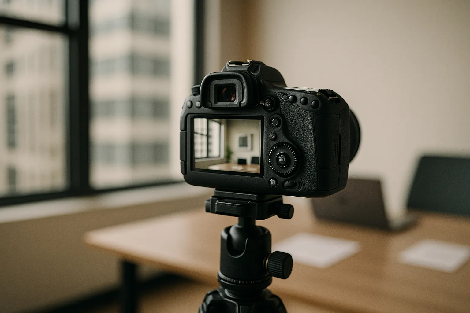
Professional Headshot Framing, Composition, Backgrounds, and Lighting
Once wardrobe is set, technical consistency is what makes a set of portraits feel "together." This is where executive headshot standards often succeed or fail, especially when mixing in remote submissions.
The simplest way to think about composition is that your headshot is a small billboard. It has to read instantly, even at thumbnail size.
Framing and composition standards: crop, eye-line, and posture
Aim for a consistent crop across the team, typically mid chest to just above the head, with a little breathing room. The eyes should sit around the upper third of the frame. Avoid extreme closeups that feel confrontational, and avoid full torso shots that make the face too small.
Ask for a slight angle of the shoulders rather than square to camera, unless your brand calls for a very formal look. Keep posture tall but relaxed. A small lean forward can create connection, as if the person is meeting you halfway.
A practical standard for team headshot guidelines:
Use the same aspect ratio for everyone, often 4:5 or square depending on where you publish. Make sure the chin is not tilted up, which can read as aloof, or too far down, which can feel timid. For expression, a soft smile is usually the safest, but encourage people to look like themselves. Forced smiles look like bad customer service.

Background and lighting setups for consistent results
Background should support brand tone. A light gray or warm neutral is a common choice because it works on websites and in printed materials. If you use an office setting, keep it softly blurred and consistent across sessions so it feels intentional rather than accidental.
Lighting is where many DIY attempts fall apart. The most reliable approach is soft, directional light from the front and slightly to one side, plus gentle fill to control shadows. Avoid harsh overhead office lighting that creates dark eye sockets and shiny foreheads. Also avoid bright windows behind the subject, which turns the person into a silhouette.
For remote employees, tell them to face a window for soft light, place the camera at eye level, and step a few feet away from the background to reduce clutter. If you want more uniformity at scale, some teams use a remote service such as Corporate Headshots from Headyshot for consistent results when in person sessions are not practical.
Branding Guidelines and Company Policy for Employee Headshots
A style is only useful if it can be repeated. The easiest way to do that is to write a short policy that removes decision fatigue: what the photos should look like, what files you need, and who approves them.
Think of staff photo requirements like a recipe. If you leave out measurements, you cannot blame the cook for a different result.
Policy template employees can follow (naming, file specs, approvals)
Use the following as a starting point and adjust to your brand.
- File naming: Lastname Firstname Department Location Year, for example, "Nguyen Maya Sales Austin 2025"
- File format: JPEG in sRGB color, plus a transparent PNG cutout only if needed for design
- Resolution: minimum 2000 pixels on the long edge, no heavy filters, no beauty smoothing
- Crops delivered: one square and one 4:5 vertical with matching eye line
- Background: approved neutral tone or approved office look, no busy home backgrounds
- Ownership and usage: company may use on website, press, internal tools, and proposals
- Approval workflow: employee selects from 3 to 5 proofs, marketing approves final crop and color
If you operate in regulated industries, add a short note about accessibility and representation. Avoid policies that pressure people to change cultural hairstyles or religious attire. Brand aligned headshot rules should standardize the photo, not erase identity.
Keep the rules about the image, not about the person. That is how you earn buy in.
Rollout and approvals: scheduling, reviews, and updates (link to our Corporate Headshots page for examples and booking)
Rollout is where good intentions meet calendars. If you can, batch sessions by department to reduce scheduling churn. For larger teams, set a recurring "headshot week" each quarter. Offer a clear time expectation, for example, ten minutes per person plus a buffer.
Create a simple review step that checks three things: the crop matches the standard, the background matches the set, and the color is consistent. Marketing should own that final pass, because they are protecting the brand.
Also set update triggers. Promotions to leadership, major hairstyle changes, and new hires are common. When people know the policy, they stop emailing you random selfies at 10 p.m.
For examples of a consistent look and to schedule a coordinated session, see our Corporate Headshots page.
If you want a broader overview of styles, standards, and a scalable workflow for teams, see this corporate headshots guide.
FAQ for Corporate Headshots Guidelines
This section answers the two questions that come up in almost every rollout. The short version is that refresh cycles and remote submissions both work, but only if you define standards before photos start drifting.
How often should we refresh company headshots?
A practical refresh cadence is every two to three years for most organizations, with exceptions for new hires and role changes. If your team is client facing and your headshots appear on proposals, consider a two year cycle. If your headshots are mostly internal, three years may be fine.
There is also a branding angle. If you rebrand your website, change your color palette, or update typography, old portraits can suddenly feel out of place. That is when a refresh pays off quickly, because your new site will look inconsistent if the photos still scream "old era." One company I worked with updated their site design and kept old portraits at first. Their bounce rate on the About page was 8 percent higher than the site average. After updating headshots to match the new look, the About page bounce rate dropped by 5 percentage points over six weeks. Correlation is not always causation, but the user experience was clearly smoother.
If you want a simple rule: update before your photos become a time capsule.
Can remote employees submit selfies if they follow these guidelines?
Selfies are risky because the camera is too close, which distorts facial proportions, and the lighting is usually uneven. If you must accept remote submissions, ask for a timer photo, not an arm length selfie. A laptop webcam can work if the employee uses good window light and places the camera at eye level.
Set a minimum bar: neutral background, face fills the frame, sharp focus on the eyes, no beauty filters, and consistent crop. If you need more pose and setup options for remote and in-office sessions, browse these corporate headshot ideas.
For more technical reading on digital color consistency, Adobe has a helpful overview of RGB and color management basics that explains why the same photo can look different across devices.
Conclusion and Next Steps
Consistency is not about making everyone look the same. It is about making everyone look like they belong in the same story. When your portraits share wardrobe intent, framing, and lighting, your brand feels calmer. More credible. More put together.
If you want to implement what you just read, start small. Pick a background style, set a crop standard, and write a one page policy that employees can actually follow. Then run a pilot with a single department. You will learn where people get confused, which wardrobe advice is too strict, and what file specs your design team really needs.
When you are ready to roll it out across the company, use a single approval workflow and schedule refreshes like any other brand asset. You would not let your logo drift from slide to slide. Your headshots deserve the same care.
If you want help turning this into a repeatable process, we can recommend a session plan, deliver a consistent set of final crops for web and print, and align everything to your brand. And if you are updating a full team directory, do not wait until the day before the annual report. Your future self will thank you. For deeper guidance on lighting, consistency, and prep, you can also reference our professional business headshots playbook.