How many prospects meet your brand for the first time on the Team page? For many companies, it’s the most-viewed non-home page on the site. Now picture that first impression: some photos are tight crops, others are full torso, a few are dark and grainy, and one was clearly taken in a fluorescent-lit hallway. Trust slips a little. Professionalism blurs.
Here’s the better picture: you can fix this, and it’s not just about buying a nicer camera. With a plan, your team page can look polished, load fast, and scale as your company grows. In this guide, we’ll show you how to plan and use corporate headshots for website experiences that feel cohesive and confident. We’ll dig into sizing and formats (so images stay sharp without bloating pages), framing and backgrounds (so every face reads clearly and on-brand), and the governance that keeps things consistent as people join, move, and get promoted. Expect practical numbers, checklists, and a few pro tricks along the way. Ready to make your team page a trust engine?
Corporate headshots for website: why consistency, framing, and formats matter
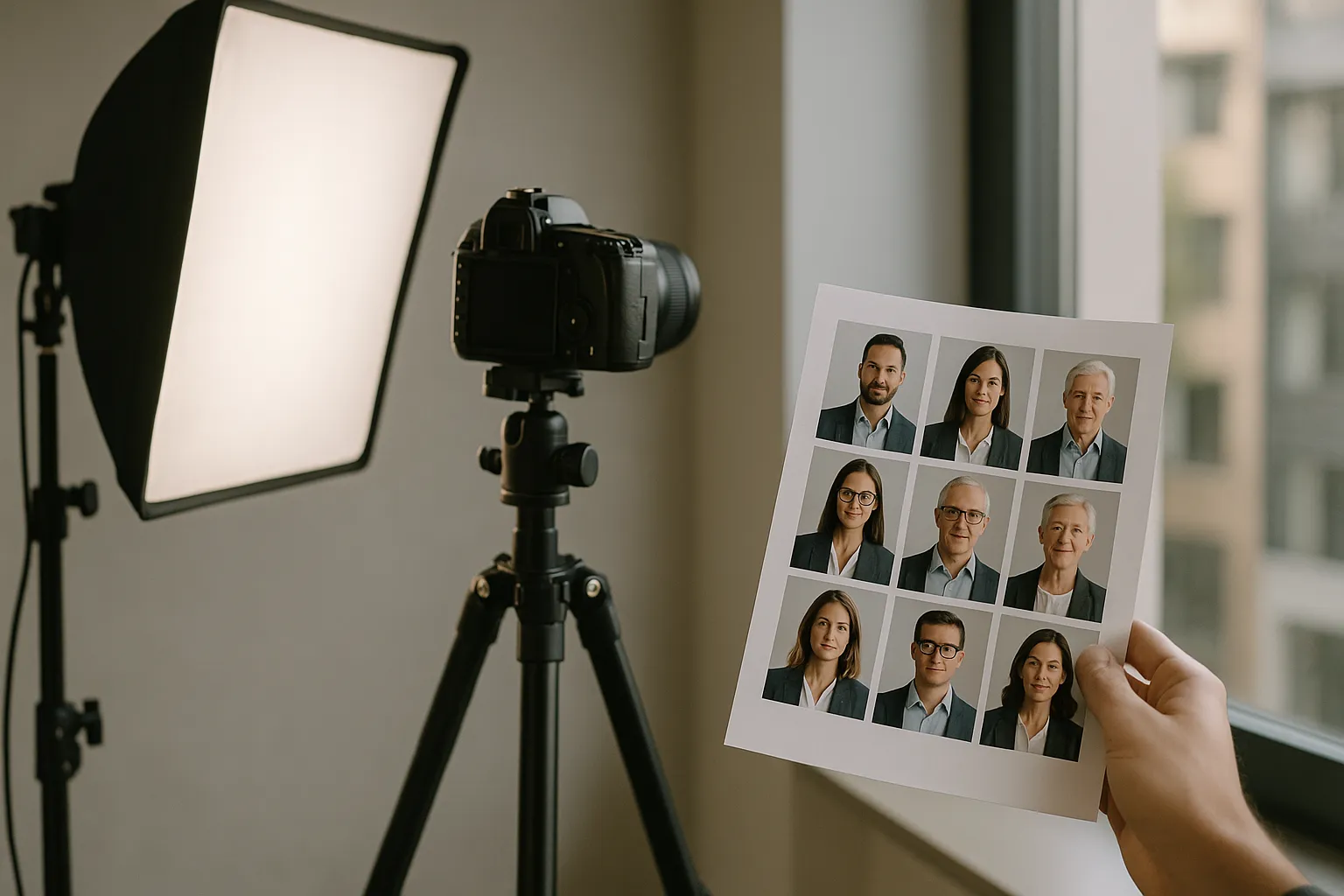
Great brand photography is a system, not an accident. When your team page looks unified, you signal reliability before a visitor reads a word. Consistency, framing, and technical formats work together like gears: miss one, and the whole machine grinds. More in our post about corporate headshots ideas.
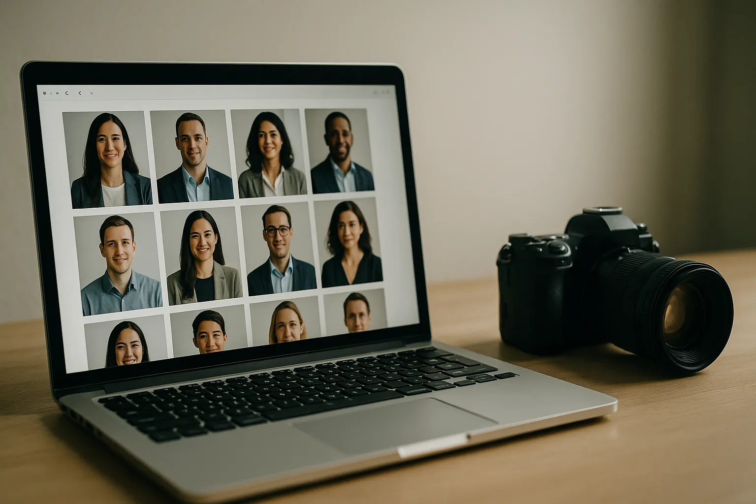
Consistency is your visual handshake. Use the same background family, lighting direction, lens choice, and crop across all staff photos for website use. Faces pop. Names are easy to scan. Perceived quality jumps. A unified look also saves time: you can templatize exports, automate alt text patterns, and simplify content updates in your CMS.
Framing is the storytelling. Put the eyes on a consistent horizontal line and keep headroom tight for presence. Shoulders should anchor the shot; necklines and collars matter more than you’d think. The goal is to make every person feel approachable and confident in a two-second glance. Clarity beats cleverness.
Formats and performance are the unsung heroes. The wrong file type or color profile can make skin tones look off or make pages stall on mobile. Choose formats that preserve detail while compressing efficiently, standardize on sRGB for cross-device color, and use responsive image techniques to keep everything crisp on high-density screens.
Here’s the punch line: cohesion converts. Visitors won’t compliment your careful choices, but they’ll feel them. And when people feel taken care of, they explore, click, and trust.
Sizing, formats, and performance: show sharp corporate headshots without slowing pages
Website performance and image quality can coexist. You just need a plan for container sizes, device pixel ratios (1x vs 2x), and compression settings. Aim for photos that are sharp at their largest display size, with responsive sources for smaller breakpoints. Add lazy-loading for below-the-fold rows, and you’ve already shaved off initial load time. For guidance on the fundamentals, Google’s web.dev image optimization is a solid primer.
We ran a simple test for a B2B SaaS brand: we converted legacy JPGs to WebP, standardized on 4:5 crops, shipped srcset with 1x/2x sources, and enabled native lazy-loading for the grid. Team page payload dropped by 61%, LCP improved by 0.7s on mid-range Android, and profile clicks to individual bios rose by 22% month-over-month. Faster pages get more curiosity taps. Could the same changes help your team page pull its weight?
Before you export, confirm the actual CSS container widths for your grid cards and bio headers. Then export at those widths for 1x and double for 2x (retina). Set a performance budget per image (e.g., 20–80 KB for grid, 80–200 KB for larger bio images). Keep color in sRGB and avoid over-sharpening; over-sharpening makes compression artifacts worse.
Best size for corporate headshots on website: pixel dimensions and aspect ratios
Design varies, but these sizes are reliable starting points. Export each size with 1x and 2x versions, and adjust to your actual layout. Keep crops consistent so faces align when users compare people side-by-side.
| Use case | Aspect ratio | Container width (1x) | Export widths (1x / 2x) | Typical file size |
|---|---|---|---|---|
| Team grid card (small) | 1:1 (square) or 4:5 | 160–200 px | 200 / 400 px | 20–60 KB |
| Team grid card (medium) | 4:5 | 240–280 px | 280 / 560 px | 35–80 KB |
| Bio/profile header | 4:5 or 3:4 | 360–500 px | 500 / 1000 px | 80–200 KB |
| Press/leadership feature | 3:4 or 4:5 | 600–800 px | 800 / 1600 px | 120–300 KB |
Square is friendly for tight grids; 4:5 or 3:4 reads more portrait-like and looks refined at larger sizes. If your design uses circles, export square crops and mask with CSS. Use loading="lazy" for anything below the fold and decoding="async" to avoid blocking rendering. Preload only the first few visible images; preloading all headshots defeats lazy-loading.

Website image formats for corporate headshots + color profiles and compression
- JPG/JPEG: Great for photographs with smooth gradients. Use high quality (e.g., 72–80%) and consider progressive encoding. Balance detail with file size; use tonal noise reduction to help compression.
- WebP: Smaller than JPG at comparable quality for most portraits. Support is broad across modern browsers; see MDN’s image format guide. Default to WebP with a JPG fallback if your stack still supports legacy browsers.
- PNG: Only when you truly need transparency. PNG files will be larger for portraits and can slow pages.
Color management matters. Export in sRGB IEC 61966-2.1 and embed the ICC profile so browsers render skin tones consistently. The W3C sRGB page explains why sRGB is the web’s baseline. Avoid wide-gamut profiles unless you’re certain your visitors browse on P3 displays with correct color management.
For compression, start with quality 80 in JPG or a WebP quality around 70–80, then eyeball artifacts in hair and gradients. Skin is unforgiving; keep cheeks and temples clean. A quick rule: if hair looks crunchy or backgrounds band, bump the quality up a notch.
Framing and backgrounds: how to frame corporate headshots for website to align with your brand
Great framing lets your audience connect with a person’s eyes in a heartbeat. Decide on a crop (square or 4:5), lock an eye-line across the set, and give just enough headroom for presence. Keep shoulders in frame so the portrait feels grounded. If you ever mix horizontal and vertical crops, ensure the face size stays consistent; otherwise, some people will loom while others vanish.
Don’t fight your UI. If your design uses circular masks, compose for a square and keep eyes slightly above center so the circle doesn’t shave off hair or chin. For dark-mode pages, test your backgrounds in both themes so the contrast stays comfortable. Little tweaks avoid big re-shoots. Imagine catching that mismatch only after launch-frustrating, right?

How to frame corporate headshots for website: crop, eye-line, and headroom
- Eye-line: Place the eyes around 60–65% up from the bottom of the frame. This feels natural and reads well in responsive layouts.
- Headroom: Keep it tight. If you’re square, leave a sliver above the hair. For 4:5, leave slightly more, but avoid “floating head”.
- Shoulders: Angle the body 10–20 degrees from camera with shoulders visible; it’s more approachable than straight-on.
- Focal length: 70–105mm on full-frame (or equivalent) to avoid distortion.
- Expression: A micro-smile beats a blank face. Think “welcoming, not posed”.
Pro tip: Lock camera height to eye-level. Too high makes people look small; too low looks imposing. A simple tape mark on the floor and a stand height note in your guide saves you on busy shoot days.
Background guidelines for corporate website headshots
Your headshot background is part of your brand system. Neutral seamless (light gray, warm gray, or off-white) is flexible and easy to match across cities. Subtle gradients add polish without distraction. If you go environmental (office, studio wall), add separation: use a wider aperture (f/2.8–f/4) and place subjects a few feet from the background for pleasant blur.
Color should harmonize with your palette. If your UI leans light, avoid pure white; choose a gentle gray so white shirts don’t vanish. For dark UI or dark mode, test on actual pages; you may need a slightly brighter backdrop to keep heads from melting into the frame.
Lighting tells a story. Soft, directional light from 45 degrees (octabox or large umbrella) with a subtle fill keeps faces dimensional. Add a hair or rim light if subjects wear dark clothing on dark backgrounds. The goal is subtle separation, not drama.
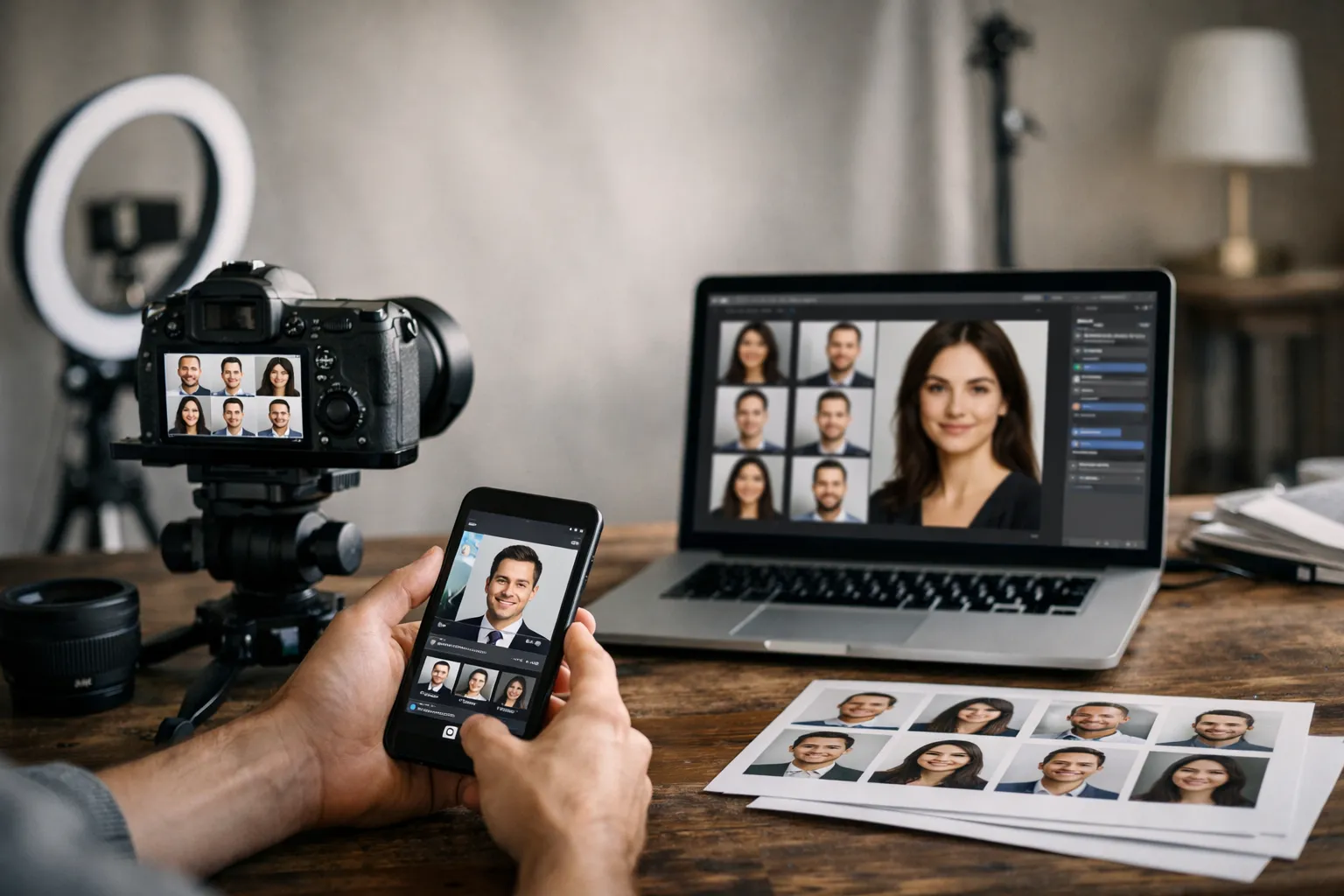
Consistency and governance: creating a repeatable system for team and About pages
The secret to a clean team page isn’t retouching; it’s governance. Write a simple one-page style guide with lighting, camera settings, framing diagrams, background codes, attire guidance, retouching boundaries, and export specs. Share it with internal coordinators and any outside photographers. When new hires come aboard, the system should already know what to do.
Schedule headshot days quarterly, plus mini-sessions for remote hires. If you’re distributed, ship a compact kit (collapsible backdrop, LED panel, stand, and a marked floor plan) and offer a 15-minute video prep. Keep samples on a shared drive so every photographer can match the look. Consistency is a team sport. Imagine a new hire in Boise and a VP in London both landing photos that look like they were shot in the same room-that’s the magic of a playbook.
“We didn’t need new cameras; we needed a playbook. Once we documented our lighting, crops, and file names, our updates went from weeks to hours.” - Brand Manager, Series B SaaS
Consistent corporate headshots for team page: lighting, angles, attire, and scheduling
Lock your lighting recipe: a large soft key 45 degrees off-axis, fill at -1 to -1.5 stops, and a gentle rim if hair or jackets are dark. White balance to 5600K and keep ISO low. Use 85mm (or equivalent) for natural proportions. Camera height at eye-level, subject angled slightly, shoulders in, eyes toward camera.
Set attire guidelines by department: client-facing teams in smart business attire, internal roles relaxed but neat, and no heavy patterns. Offer a prep note (avoid glossy makeup, steam collars, tame flyaways), and provide a lint roller on set. One coordinator can keep sessions on time and upbeat. A bowl of mints and a quick mirror station do wonders for confidence.
Operationally, book 10-minute slots with a 5-minute buffer. Keep a backup day and a plan for remote staff. Record the exact studio distance, light power, modifier, and camera settings in your style guide. When someone asks “How did we light Finance last quarter?”, you’ll have the answer.
Corporate headshot file naming conventions for web and DAM workflow
Names should be human-readable, search-friendly, and consistent. A dependable pattern: firstname-lastname-role-department-location-year.ext. Example: jane-doe-vp-sales-new-york-2025.webp. Use lowercase and hyphens, no spaces. If there are multiple images per person, append -1, -2, or -portrait, -profile.
Embed metadata so assets are future-proof: add IPTC fields for person’s name, title, department, photographer, shoot date, and usage rights. In your DAM, tag images with status (approved, needs-retouch) and versions. On the web side, pair each image with alt text like “Portrait of Jane Doe, VP of Sales at Acme”.
One more governance tip: store a master high-res in your DAM and auto-generate web derivatives (1x/2x, WebP/JPG) through your build process or CMS. No more manual resizes at midnight. Wouldn’t you rather spend that time launching new pages?
FAQ for corporate headshots for website
What is the ideal aspect ratio for corporate headshots on a website?
Most brands pick 4:5 or square. Square crops are easy for grids and circular masks; 4:5 looks refined for larger profile photos. The key is consistency: lock one ratio and apply it to every person so faces align visually.
Should we export headshots as JPG, PNG, WebP, or AVIF-and when?
Use WebP by default with a JPG fallback. JPG still looks great at modest file sizes. PNG is only for true transparency (rare in portraits). AVIF can be even smaller than WebP but may require extra processing time and careful QA; if your stack supports it reliably, include it in your srcset for modern browsers.
What file size should we target for fast-loading headshots?
As a rule of thumb: 20–80 KB for grid cards and 80–200 KB for bio images. Complex hair or textured backgrounds may push you higher. Prioritize crisp eyes and clean gradients; then tune compression down until artifacts disappear.
How do we keep colors consistent across devices and browsers?
Export in sRGB and embed the ICC profile. Calibrate your monitors if you shoot in-house. Avoid mixing wide-gamut exports with standard-gamut ones. Always test on popular browsers and phones before deployment.
What alt text is best for accessibility and SEO on team headshots?
Describe the person and role, not the picture mechanics. “Portrait of Alex Chen, Product Designer at Nimbus” is clear. Skip filler like “image of”. If a headshot links to a bio, the alt can mirror the person’s name and role since the link context is obvious.
How often should we refresh or reshoot corporate headshots?
Plan a refresh every 18–24 months or when your brand style changes. Reshoot promptly for significant changes in appearance or title. Batch updates quarterly so the team page never looks half-new, half-old. It’s easier to maintain momentum than to start over.
Conclusion: launch a polished, fast, and consistent headshot experience
Explore corporate headshots services and portfolio
If you want a single partner to plan, shoot, and deliver a unified system of images, take a look at Corporate Headshots from Headyshot. Their approach emphasizes consistent lighting and cropping, plus web-ready exports, which makes it painless to publish.
Get a quote for corporate headshots
Use this quick checklist to move from intention to implementation:
- Confirm your crops, aspect ratio, and eye-line with design comps.
- Lock lighting, background, and attire in a one-page style guide.
- Set export specs (sizes, 1x/2x, WebP + JPG fallback, sRGB) and a file-naming pattern.
- Build srcset and lazy-loading into your CMS templates; test with PageSpeed.
- Schedule recurring shoot days and a process for remote new hires.
Do this once and you won’t be chasing mismatched photos next quarter. You’ll be shipping a dependable, scalable system of corporate headshots for website use that makes every team member look their best and every page load feel instant.
References worth bookmarking: MDN on image formats, web.dev performance guides, and the W3C overview of sRGB.