If you’ve ever landed on a company “About” page and thought, “Wait-do these people even work together?”, you’re not being picky. You’re noticing the little tells: one photo is a tight crop, another is a full torso; one person is lit like a passport photo, another looks like they’re standing in a sunbeam; half the backgrounds are office walls, the rest are kitchen cabinets.
None of this is anyone’s fault. It’s just what happens when headshots accumulate over time-a new hire here, a rushed conference badge photo there, a remote teammate sending in the best thing they could capture between meetings. But the effect is real: a mismatched grid quietly says, “We didn’t think this through.”
That’s what this team headshots guide is for. Not a fantasy world where everyone is in the same city on the same day, but the real one: mid-quarter hires, distributed teams, changing titles, and brand teams who still want the company to look steady. We’ll pin down what “consistent” actually means, give you copy-and-paste specs for crop and file delivery, and walk through a background framework that takes the guesswork out of approvals.
We’ll also cover styling and grooming guidelines that feel human (not fussy), plus a practical capture-to-AI workflow for getting headshots to match across locations. And if you’re deciding between an in-house setup and a studio, we’ll make that call easier too.
Sound like overkill for a few photos? Here’s the thing: headshots are tiny trust signals. They show up on your website, recruiting pages, sales outreach, press bios, and conference slides. When they look like they belong together, your brand feels intentional. When they don’t, people feel the wobble-even if they can’t explain why.
What Consistent Team Headshots Mean (and Why They Matter)
Consistency isn’t about turning everyone into clones. It’s about removing visual noise so the person comes through-and the brand feels calm and credible behind them. When headshots match, your site looks curated, recruiting pages feel more trustworthy, and sales teams look more “real” in outbound.
Have you ever clicked through a leadership page and felt a weird split-second hesitation? That hesitation is often visual inconsistency dressed up as “vibes.” Good headshots reduce that friction.
Define Consistency: Crop, Light, Background, Expression
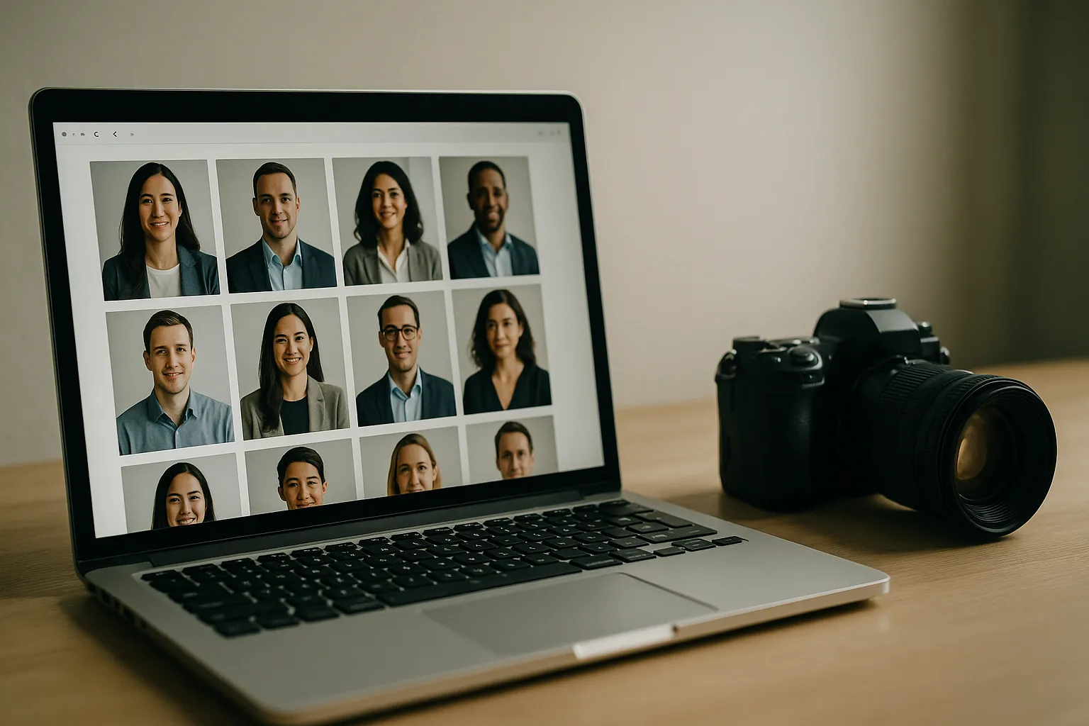
Start with crop. If one person is framed mid-chest and another is a tight face-only crop, your brain reads it as disorganization. You might not consciously think, “Their crop is inconsistent,” but you’ll feel, “This is messy.” A consistent crop creates an invisible grid that makes the whole lineup feel deliberate.
Next: lighting. Flat overhead office lighting can make people look tired and gray. Soft window light can look fresh and friendly. Mix them on one page and the photos start to look like they were collected from different eras-because, essentially, they were. Pick a lighting style (soft and bright, or moodier and directional) and keep it.
Then there’s background-your brand’s stage. A busy coffee shop behind one person and a blank wall behind another doesn’t just change the aesthetic; it changes perceived context and even seniority. Background consistency can be literal (same color, same backdrop) or stylistic (same tone, blur level, and contrast). Either works, as long as it’s intentional.
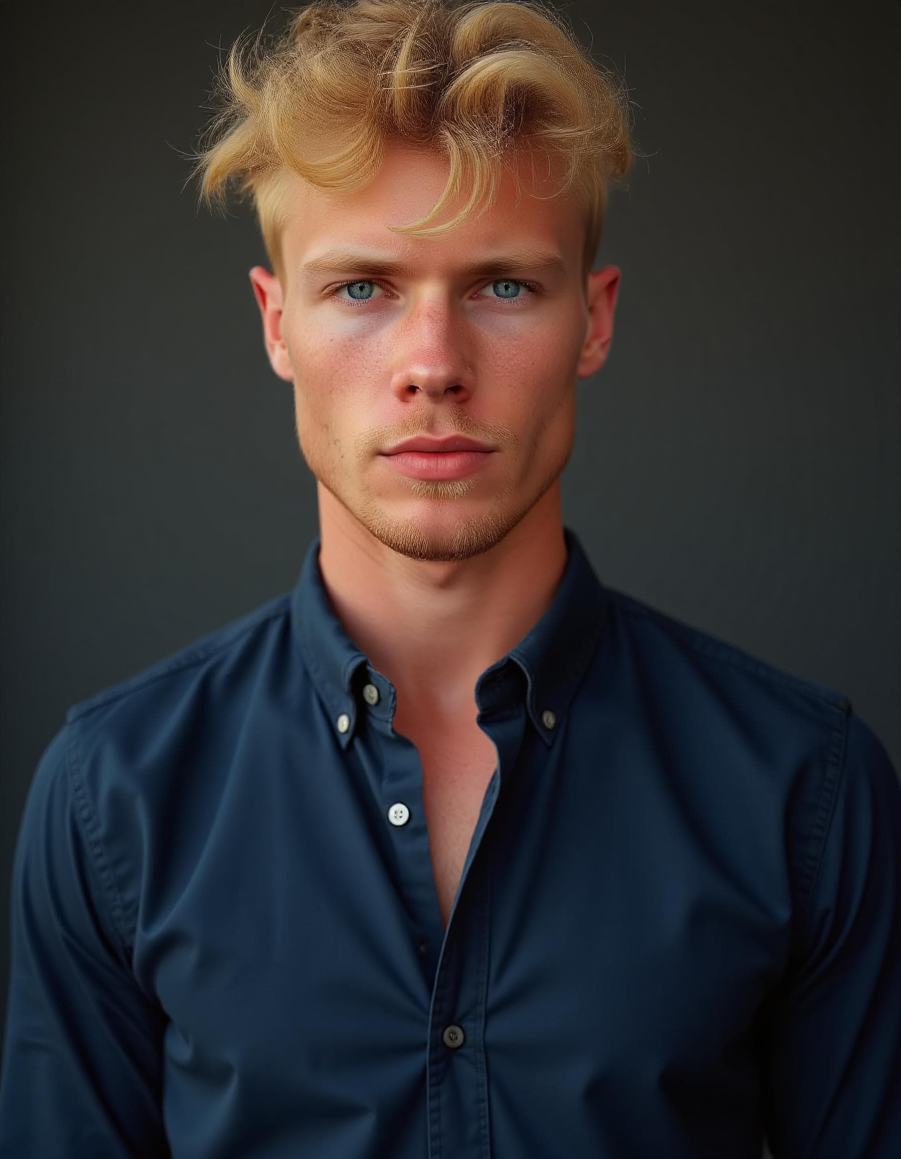
Finally: expression. No, you don’t need the exact same smile. But you do need the same energy. One guideline that works across almost every industry: “friendly, confident, relaxed jaw, eyes to camera.” Here’s the line worth repeating to your team: your headshots should feel like one conversation, not six different meetings.
A quick micro-story: a mid-size SaaS company updated portraits for 42 employees and aligned crop, lighting, and background tone across the grid. After the refresh, their careers page saw an 18% increase in “Apply” clicks over the next six weeks, with no other page changes. The photos didn’t create the whole lift, but they removed friction. The page felt more trustworthy-so more people moved forward.
Brand Guidelines for Employee Headshots: Specs You Can Copy
Before you talk wardrobe or AI, lock down the boring stuff. Specs keep “almost right” headshots from creeping in over time. Think of this as staff portrait standards that protect your site from slow visual drift.
If you’ve ever had someone upload “a perfectly good photo” that somehow looks off once it’s in the grid, you already understand why this matters-and a simple set of corporate headshot guidelines helps keep future updates from drifting.
Technical Specs: Dimensions, Crop, Framing, File Naming
Your goal is to make headshots easy to place anywhere: website, HR system, press kit, conference slides. The cleanest system is one master file per person, with smaller versions generated from it.
Here’s a practical baseline most web teams can live with. If you already have a design system, match these numbers to it and document the choice so future updates don’t drift.
| Item | Recommended standard | Notes and rationale |
|---|---|---|
| Master image size | 2000 x 2000 px | Square masters crop well for web grids and social. |
| Web delivery size | 800 x 800 px | Crisp on retina screens without being heavy. |
| Crop guidance | Top of head to mid chest | Keeps faces readable while showing a little posture. |
| Eye line placement | Eyes at about 40 percent from top | Prevents “floating chin” or “too much forehead.” |
| File format | JPG for photos, WebP as optional | WebP can reduce size. See Google’s WebP overview. |
| Color space | sRGB | Most browsers assume sRGB. Reference: ICC sRGB information. |
| Naming convention | lastname firstname team year v01.jpg | Example: “chen maya marketing 2026 v01.jpg” |
A few operational habits save real headaches later. Store the highest-quality original in a secure shared location, and store the cropped square as a separate web-ready version. Put the year in the filename so you can audit outdated portraits quickly. And decide on one retouching level and stick to it: light blemish cleanup and color balancing are fine; heavy skin smoothing tends to look strange fast, especially as styles change.
If you want an external reference for what a professional platform expects, LinkedIn’s help center has simple guidance that aligns well with these basics, especially around clarity and face visibility: LinkedIn profile photo tips.
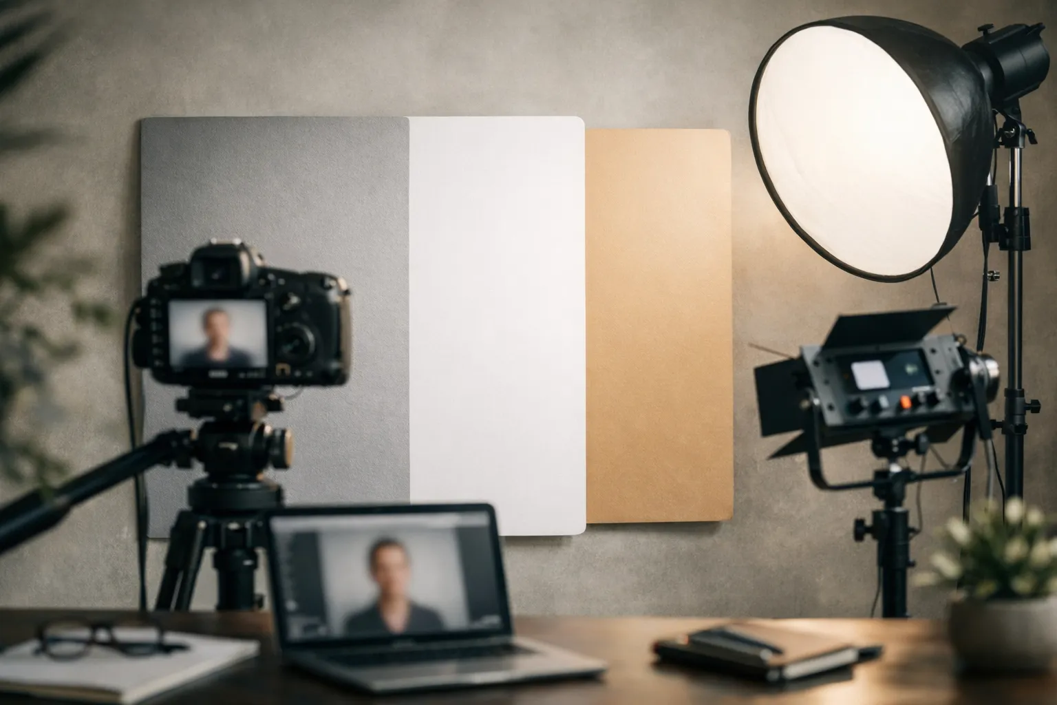
Best Backgrounds for Corporate Team Headshots: A Selection Framework
Background is where many corporate headshot style guide efforts fall apart, because it starts to feel subjective fast. A framework makes it repeatable-and makes approvals much less emotional.
Ask three questions.
First: what should the background say about your brand? Crisp and modern? Warm and human? Traditional and formal? Neutral light gray often reads modern and friendly. Pure white can feel clinical if the lighting isn’t perfect. Dark charcoal can feel premium, but it demands careful exposure so faces don’t look muddy.
Second: where will these headshots live? If portraits show up as small circles or tiny thumbnails, subtle backgrounds win because detail disappears at that size anyway. If portraits appear as larger cards on a leadership page, you can support a little texture or a gentle gradient without distracting from the face.
Third: how much change can you tolerate over time? An office wall will change if you move offices or remodel. A studio backdrop or consistent virtual background is easier to maintain as the company grows.
When you standardize, aim for “same family,” not necessarily “same pixel.” A soft neutral background with consistent brightness and blur level will read unified even if the exact shade varies slightly.
“The background should never be the most interesting thing in the frame. If it is, the photo is doing two jobs and failing at both.”
Use that quote as a gut check during review. If someone’s brick wall becomes the star of the lineup, you already know what to fix.
Team Headshot Styling Guide for Companies
Styling is where you balance individuality and brand. Done well, it feels effortless: everyone looks like themselves, just slightly more polished. Done poorly, it can feel like a costume party disguised as “brand consistency.”
So how do we keep it simple and effective? We focus on the few choices that show up strongly on camera: color, contrast, and visual distractions.
Attire and Color Palettes by Brand and Role
Think in color harmony, not matching outfits. Choose a palette range that complements your brand colors and works across skin tones. Many teams do well with mid tones-navy, charcoal, olive, cream, soft blues-because they photograph consistently and don’t bounce weird color casts onto faces. Neon colors and super-saturated reds can reflect onto skin and create uneven tones across the grid.
Patterns are another quiet troublemaker. Thin stripes and tight checks can create moiré (a weird shimmering effect) once the image is resized for the web. Solids or very subtle textures are safer.
Pure white tops can work, but they’re less forgiving: they blow out easily under bright light and often become the brightest thing in the frame. If your team is capturing photos in mixed lighting, steer people toward off-white, cream, or light gray instead.
A practical approach that reduces back-and-forth: ask employees to bring (or choose) two options-one “safe” look they’d wear on a client call, and one slightly more “them.” The photographer (or editor) can pick what reads best on camera.
When formality varies by role, set a baseline rather than writing a novel. For example: “business casual with optional blazer.” Then get stricter only where it matters most, like a leadership page, investor deck, or press kit.
Grooming, Glasses, and Accessories Rules
Grooming guidance should be respectful and minimal. The goal is to reduce distractions, not to police identity.
For hair, encourage people to show up looking like themselves on a normal workday. A fresh trim is great if it’s already planned, but “over-styled” hair often looks unlike the person you meet on Zoom.
For makeup, keep it optional and practical. If someone wears makeup, natural, camera-friendly choices tend to work best, and matte products can reduce shine under lights. If someone doesn’t wear makeup, the rule is simple: don’t add pressure.
Glasses are the big wildcard. Glare can ruin an otherwise great portrait, so it helps to bring options: their usual pair, and (if available) a pair with anti-reflective coating. A good photographer can adjust lighting, but having a backup pair saves time.
Accessories are where small decisions create big differences at thumbnail size. Simple pieces read cleanly. Large earrings, shiny necklaces, and reflective watches can steal attention, especially when the photo is displayed as a tiny circle.

One rule that prevents awkward results: if you wouldn’t wear it to a client video call, don’t wear it for the portrait.
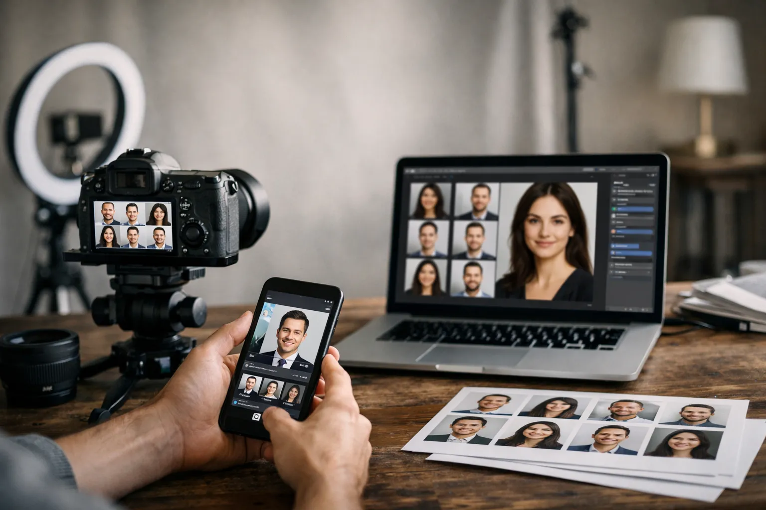
How to Create Consistent Team Headshots: From Capture to AI Workflow
A modern workforce headshot playbook has to handle two realities at once: teams are distributed, and new hires don’t arrive on your annual photo day. The fix is a repeatable capture standard paired with a controlled editing pipeline-including AI, where it actually helps.
If you want to avoid rebuilding this process every time your team grows, a scalable solution for employee headshots can save significant time and friction. On our page about corporate headshots for companies, we show how consistent team headshots can be created and maintained across locations, remote hires, and ongoing team changes, without sacrificing visual consistency or brand trust.
Let’s be honest: the goal isn’t “perfect art.” It’s repeatability. Can you get the next ten headshots to look like the first ten? If you’re building this from scratch, it can help to reference what typically goes into professional business headshots so your standards are realistic for day-to-day use.
Remote Team Headshots with AI Background Replacement
Remote capture works when you standardize three things: camera height, light direction, and distance from the lens. The easiest setup most people can follow is straightforward: face a window, place the camera slightly above eye level, and step a few feet away from the background for separation.
AI background replacement is most useful when your team has an approved brand background and you want every new hire to match it. The typical flow looks like this: capture a clean portrait against a simple wall, cut out the subject, and place them onto the approved background.
One caution, because it saves a lot of disappointment: AI can’t rescue everything. If the face is lit harshly, the angle is from below, or the image screams “selfie,” swapping the background won’t remove that feeling. The capture still has to be decent.
You may be wondering, “Can we just send everyone a link to a tutorial?” You can-but make it a vetted one for the exact tool your team uses (Photoshop, Lightroom, Canva, or a dedicated headshot platform). Since links and tools change quickly, it’s usually safer to keep that video internal and updated by whoever owns your workflow.
AI Workflow for Matching Team Headshots (Lighting, Crop, Skin Tone)
Think of this as a conveyor belt. Every headshot goes through the same stations, so the output looks coherent even when the inputs vary.
| Step | What you standardize | Practical checks |
|---|---|---|
| 1. Intake | Source files and permissions | Confirm usage rights for web, press, and internal tools. |
| 2. Select | The “hero” frame | Choose one image per person that matches the expression guidelines. |
| 3. Normalize crop | Framing and eye line | Use the same square template with eyes at consistent height. |
| 4. Balance exposure | Brightness and contrast | Compare side by side on one screen. Avoid one face looking two stops darker. |
| 5. Color correct | Skin tone and white balance | Keep it natural. Do not chase identical skin tones; chase believable tones. |
| 6. Background match | Tone, blur, and edge quality | Watch for cutout halos around hair and shoulders. |
| 7. Export | Size, format, metadata | Export sRGB, compress responsibly, name files consistently. |
| 8. QA review | Whole grid consistency | Review as a lineup on the actual webpage background color. |
If you want a simple test: open your team grid at the size users actually see, then squint. If one person pops for the wrong reason-too dark, too warm, too sharp, too “selfie”-that’s the mismatch to fix.
A small case study: a distributed consulting firm had 120 legacy portraits collected over six years. They standardized crop first, then normalized exposure and white balance, and finally used background replacement on only the most inconsistent images. The marketing team reported a 35% reduction in time spent updating bios because new headshots could be processed in minutes instead of bouncing through long email threads.
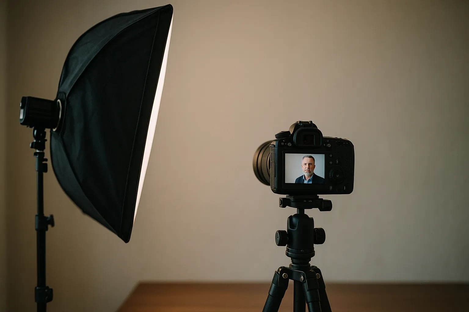
In‑House vs Studio Team Headshots: Tips to Choose the Right Approach
There’s no universal answer. The right choice depends on budget, speed, geography, and the level of polish you need. The key is to decide based on where the photos will be used-not just what’s cheapest.
Ask yourself one blunt question: are these photos mostly internal and practical, or are they representing you to the outside world every day?
When an In‑House Shoot Makes Sense
An in-house session is ideal when you have lots of people in one location, a limited budget, or frequent updates. If your company is growing fast, the “perfect once a year” approach can fall behind quickly.
In-house also works well when you want a candid, approachable feel and you can control a consistent setup in a conference room: one backdrop, one light, one camera position, and one person responsible for keeping it consistent.
When to Hire a Studio
Studios shine when you need consistency at scale, high-quality retouching, and a smooth experience for executives who have very little time. A corporate studio team also knows how to handle glasses glare, skin tone balancing across diverse teams, and clean separation from the background.
If you’re comparing options, a corporate specialist like this overview of what corporate headshots are can be a helpful reference point for what a professional corporate team photo guide typically includes.
Use these decision cues.
- Choose in-house if you need speed, frequent refreshes, and can accept slight variation.
- Choose a studio if the headshots are investor-facing, press-facing, or leadership-heavy.
- Choose a hybrid if you have one headquarters plus remote hires, and you want one look across all locations.
- Choose a studio if you need high-volume scheduling and consistent direction for expressions.
- Choose in-house if you have a strong internal marketing team who can manage templates and quality control.
One line to keep you honest: quality isn’t only about sharpness-it’s about repeatability.
Conclusion and FAQ for Team Headshots Guide
A strong set of headshots is like good signage. When it’s done well, you stop noticing it. When it’s messy, you feel the confusion immediately.
The team headshots guide approach is simple: define standards once, then maintain them gently over time with templates, a clear workflow, and a real QA moment where you review the full lineup together.
If you take nothing else from this, take this: headshots aren’t just photos. They’re a promise about who you are as a company. Are you polished? Warm? Detail-oriented? Reliable? Your grid answers those questions before anyone reads a word.
How Often Should We Refresh Team Headshots?
Most teams refresh every two to three years, with exceptions for major appearance changes or role changes that affect how public-facing someone is. If your company grows quickly, consider a rolling refresh: photograph new hires monthly or quarterly, and reshoot leadership on a predictable annual cadence.
A useful rule is, “When the photo no longer looks like the person on a video call.” If employees keep hearing, “Oh, you look different in your photo,” it’s time.
What’s the Fastest Way to Standardize Legacy Headshots?
Start with one crop template and apply it to every image. That alone usually makes a surprisingly big difference.
Next, normalize brightness and white balance so faces sit in the same exposure range. Then decide whether to standardize backgrounds: you can either select a small set of approved real backgrounds or use background replacement for the most inconsistent photos.
If you’re short on time, prioritize the pages that matter most-leadership, sales, recruiting-and update the long tail later. Would you rather have a perfect archive, or a credible front door? Small wins add up quickly, and the grid will look more cohesive with each batch you standardize.